

Utilizing "Styles" for Efficient Production and Management
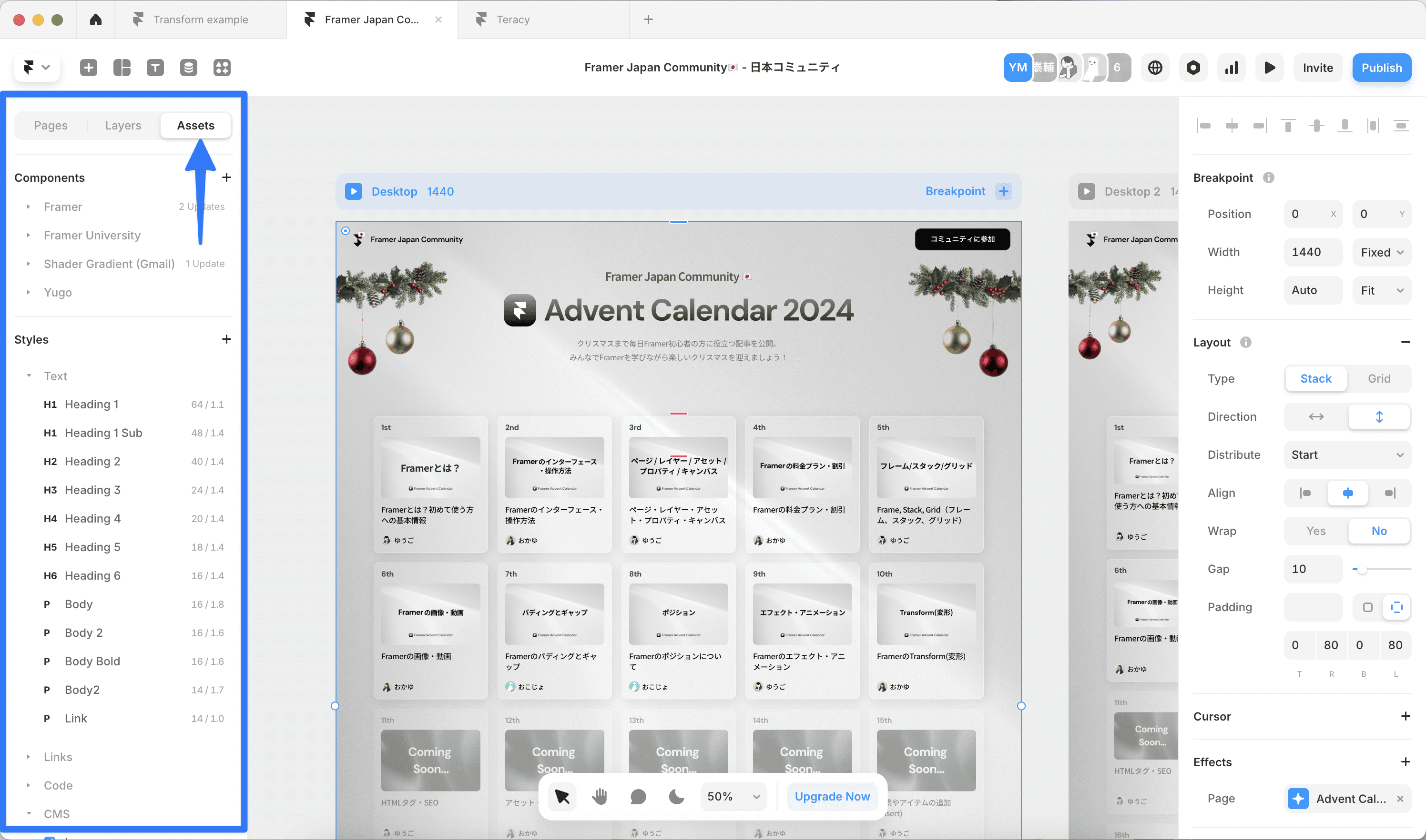
Asset Panel
The assets on the left panel of Framer are an important place to manage reusable elements within the project. They mainly include the following elements:
Components: List of reusable UI components
Styles: List of text styles and color styles
Code: List of reusable Code Overrides
Let me explain the Styles in detail.
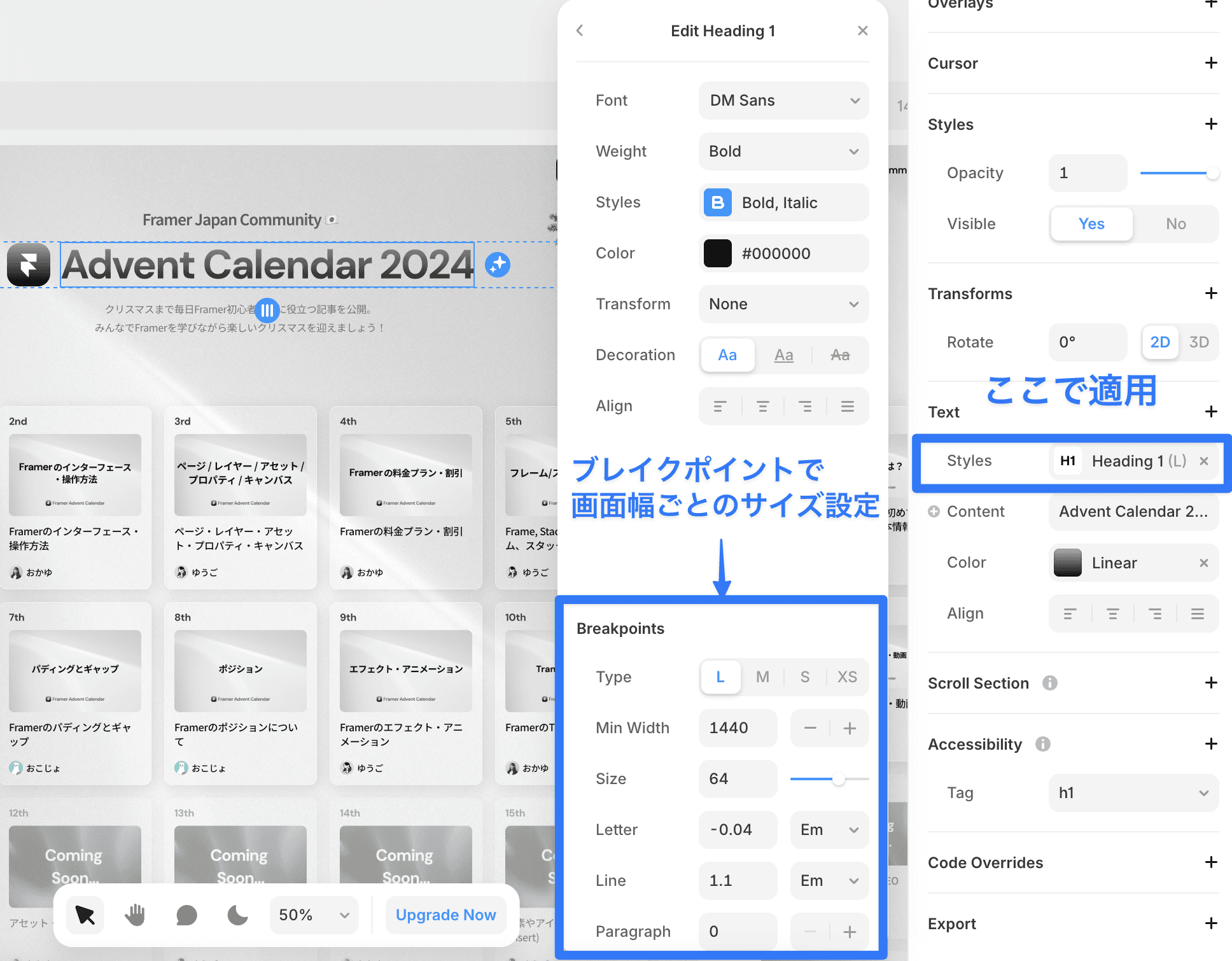
Text Styles
Text styles are features that allow centralized management of text attributes such as font, size, and color. Once you create a style, you can maintain a consistent text design across the entire site.
Applying Text Styles:
Select the text element
Choose the style you wish to apply from the Text → Styles in the properties panel
Setting Breakpoints:
You can specify font sizes and line heights that correspond to different screen sizes, such as 64px for desktop, 48px for tablet, and 32px for mobile. You can hover over the text style to configure it from the Edit button.
Color Styles and Dark Mode
You can define the colors used throughout the site.
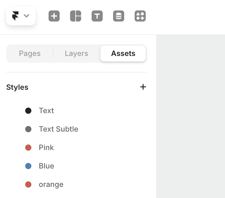
You can also set colors for both light mode and dark mode.
With the dedicated icon in the canvas toolbar, you can easily switch between light mode and dark mode (Shortcut: ⌃⌘N). This allows you to see how the design looks in both modes in real-time.

By effectively utilizing styles in this way, you can maintain design consistency while enabling efficient work.
←