

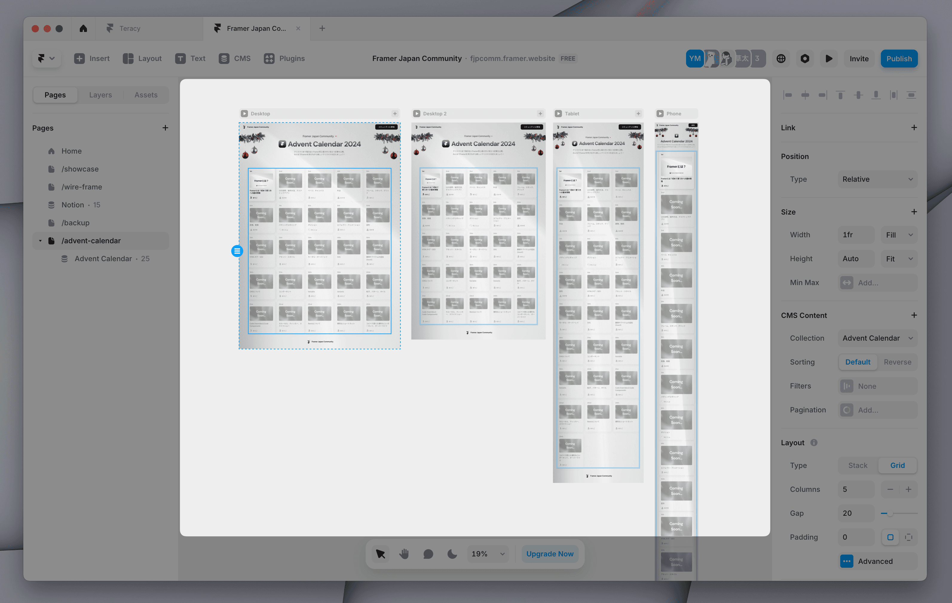
Framer Interface
Framer adopts an intuitive interface similar to common design tools like Figma.
Left: Page switching and layer display, etc.
Center: Workspace
Right: Settings for the selected element
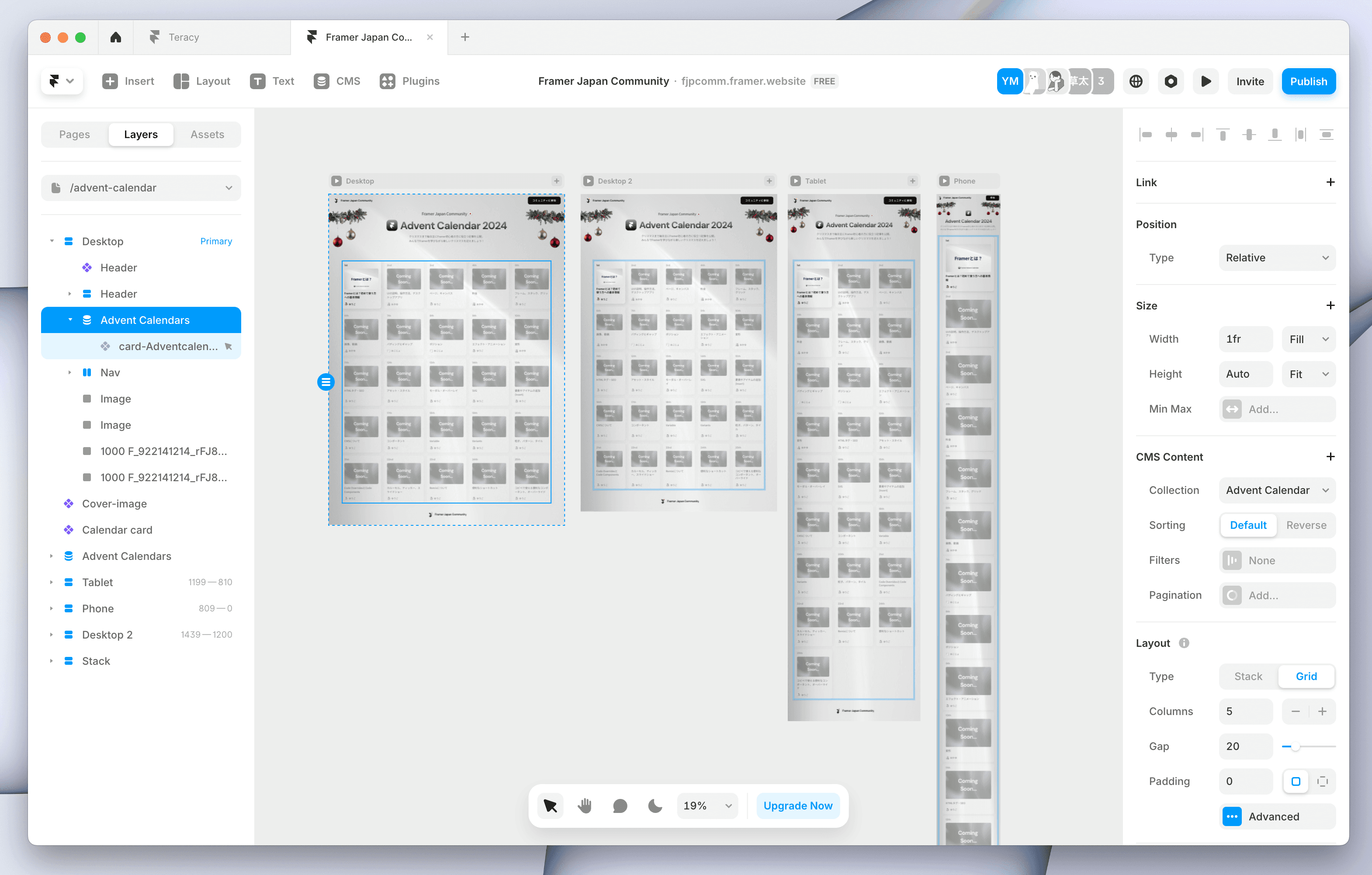
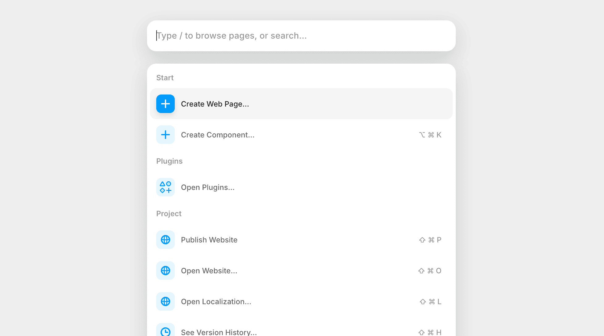
When you are unsure where to find what you are looking for, press the quick action shortcut (Mac: Command + K / Windows: Control + K) to search. You can quickly access the features or commands you need.
Top Toolbar
Access to main features is at the top.
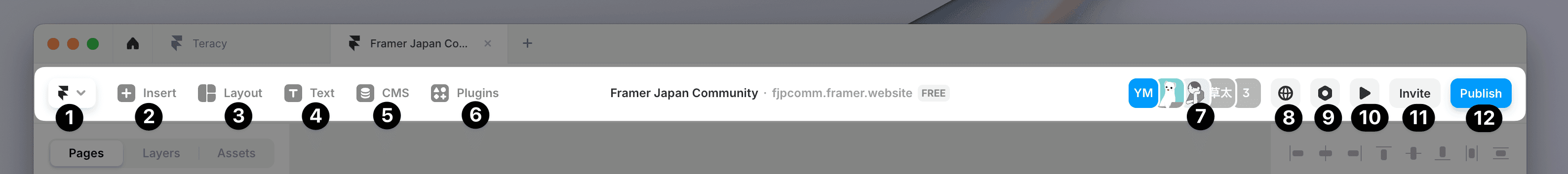
Framer Logo Button (Preferences, etc.)
Insert
Layout
Text
CMS
Plugins
Collaborators
Language Settings
Settings
Preview
Invite
Publish
Left Sidebar
This is where you switch pages, display layers, and manage assets.
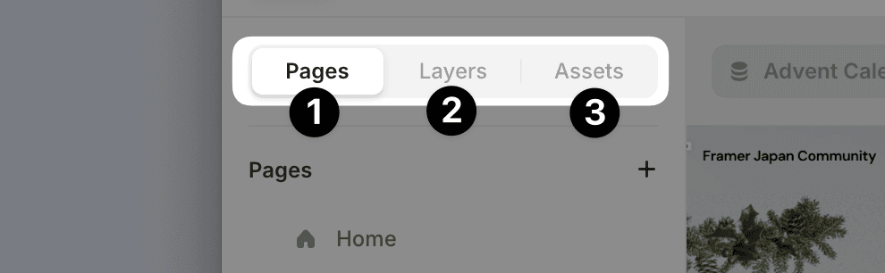
Page Panel
Layer Panel
Asset Panel
Right Sidebar (Properties Panel)
This is where you set detailed settings for the selected element.
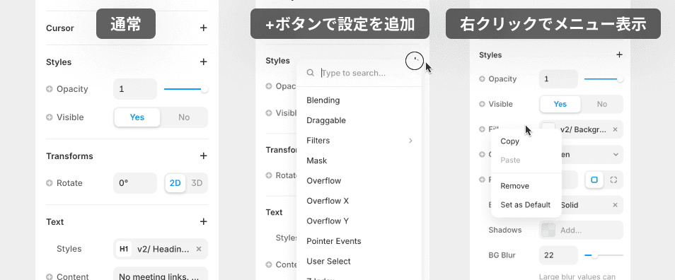
Things that may be initially easy to overlook include the following.
Click the “+” button to add settings for each section
Settings that are not frequently used, such as Z Index, are hidden under +.Right-click to bring up the menu
Copy & Paste of settings is also possible. You can easily apply complex settings like fill, shadow, and animation to other elements.
Canvas
This is the workspace where you design and arrange elements.
You can freely place elements outside the frame of the published website, and it can also be used to keep pending designs next to each other, create images, etc.
Canvas Tools
This is the toolbar for operations like commenting and switching modes.
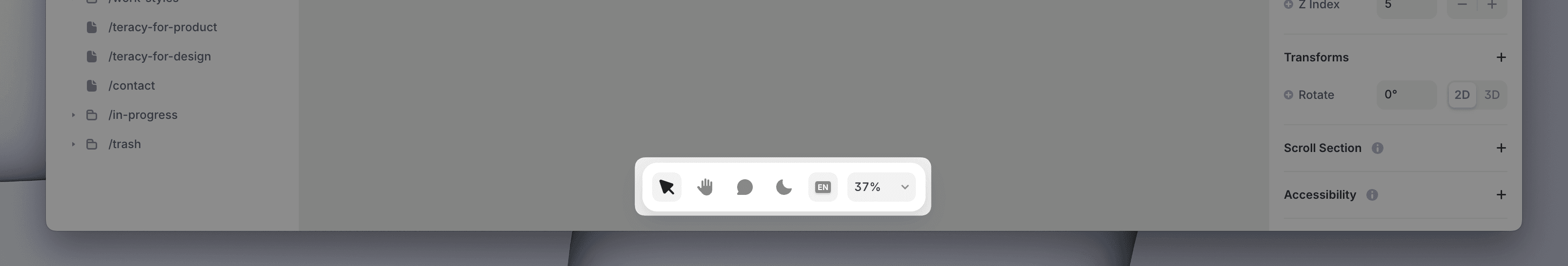
Pan Tool (temporarily switch with the spacebar)
Comment Tool
Dark/Light Mode Toggle
Language Mode Toggle
Zoom Control
Desktop Application
Framer is available as both a browser tool and a desktop application. The performance is nearly the same in both, so you can use whichever you prefer. Only the desktop application has the functionality to export images and SVGs.
Download here
←