

Pages
The Pages in the left panel allow you to manage multiple pages within your project. When you create a new project, the Home (Index) page is displayed by default. This page cannot be deleted and serves as the top page of the website.
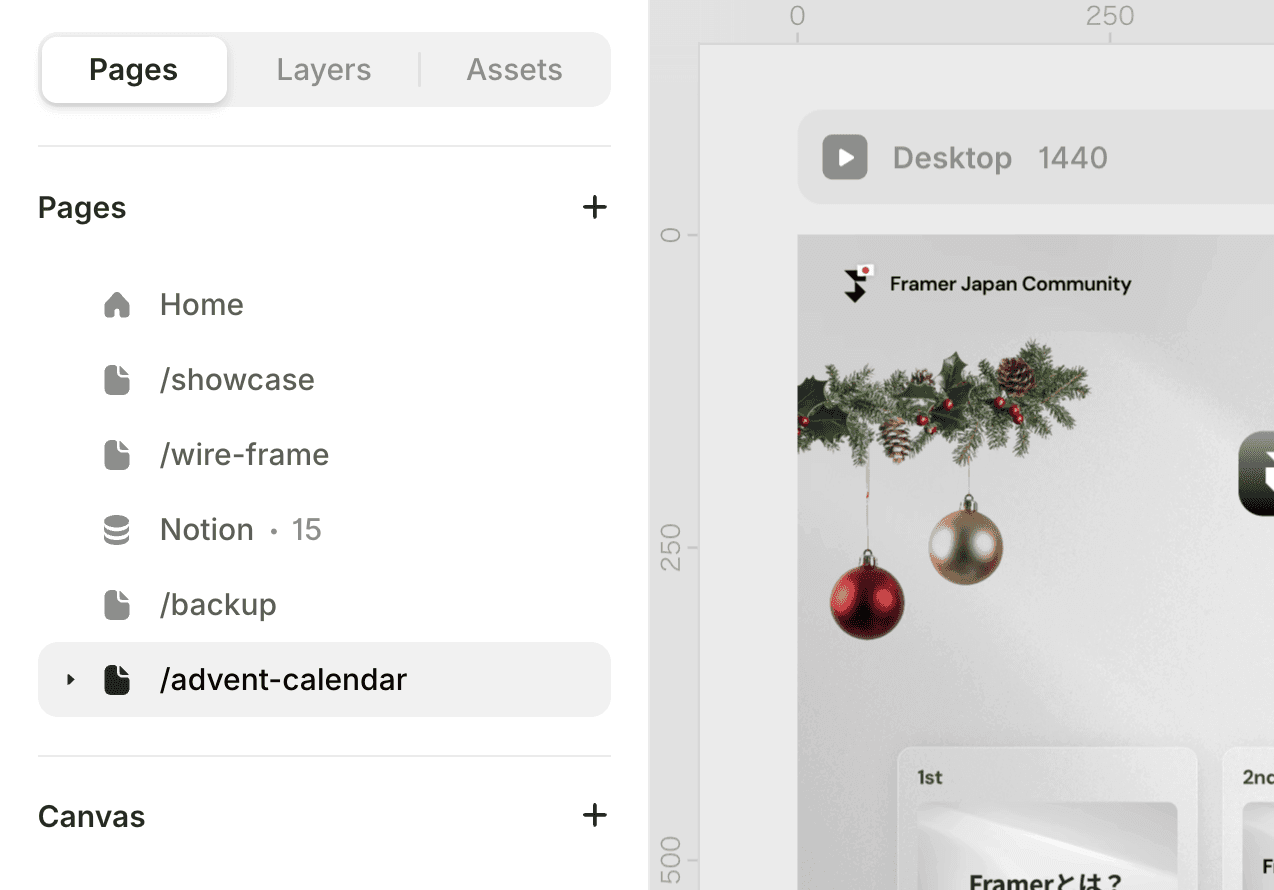
The name of the page will become the directory name of the site. (e.g., About→***.com/about)
Hover over the page name, and a menu will open from the dot icon that includes additional options. In this menu, you can change the page name, duplicate an existing page (including all its content), delete the page, draft the page, and configure page settings.
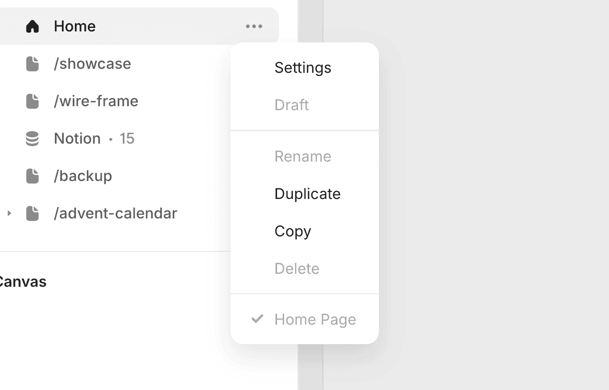
You can quickly rename the page by double-clicking on the page name. If you enter a slash (/) after the page name, it will become a folder.
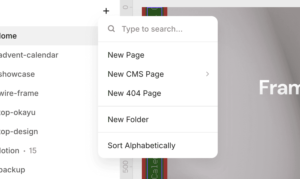
Adding a New Page.
You can add a new page from the "+" button. You can also add dynamic pages using a CMS, as well as 404 pages from here. You can create folders that group pages together. You can sort them alphabetically using "Sort Alphabetically".
Layers
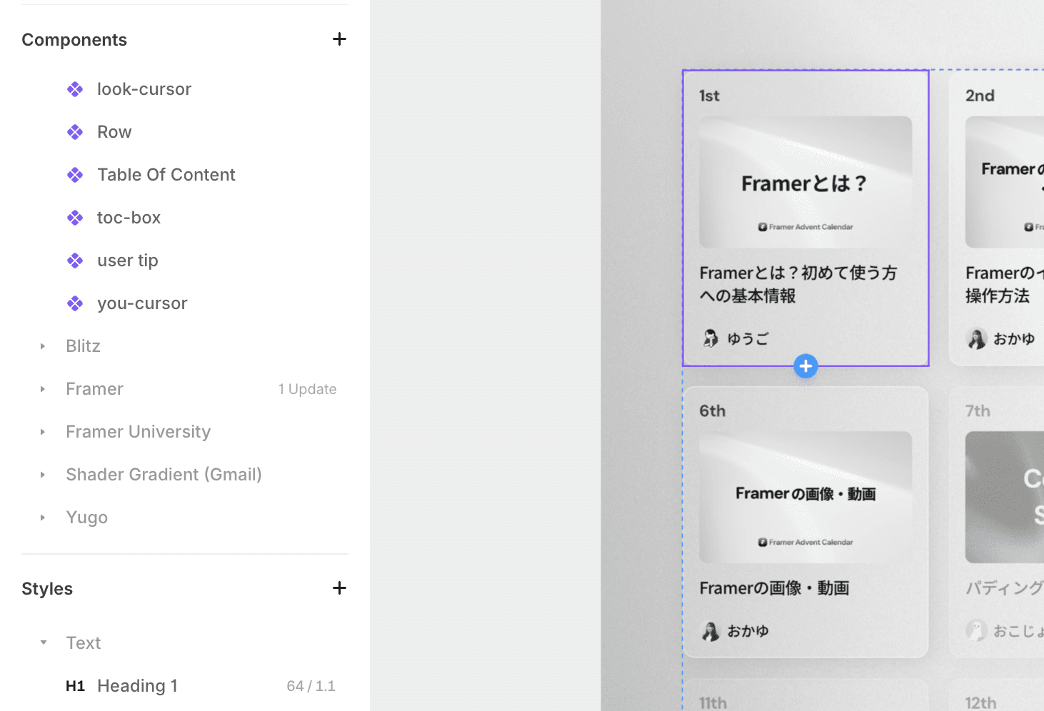
Layers display all elements (layers) contained in the current page in a hierarchical structure, similar to Figma. The currently selected element is displayed in blue in the layers. If there are child elements, they are displayed in light blue. If you are selecting a component, it is displayed in purple.
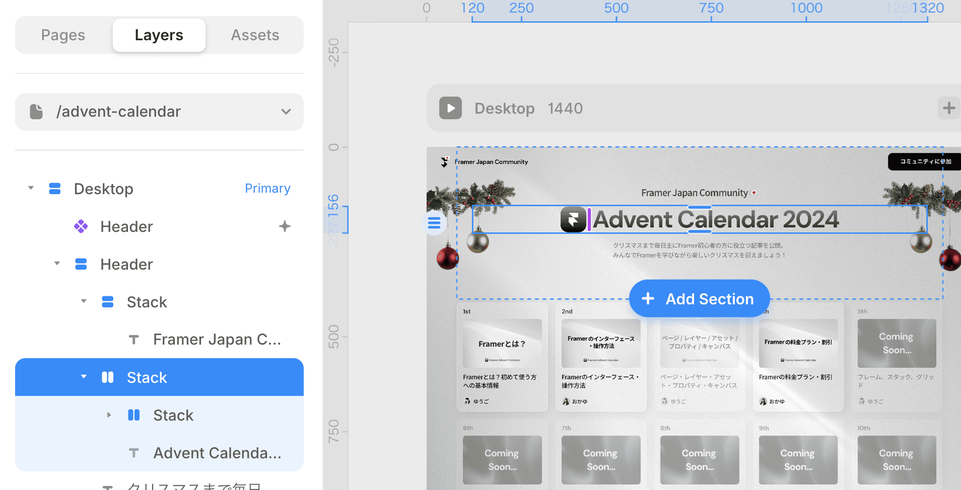
By pressing the Tab key while selecting an element, you can select the next layer. Shift + Tab selects the previous layer. You can select the parent element's layer by pressing the Escape (esc) key, and press Enter to enter child elements, selecting all layers inside.
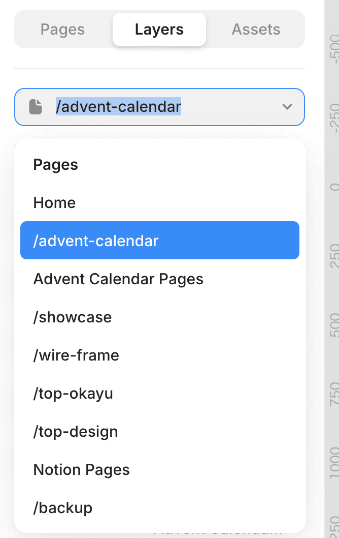
You can also navigate pages from the layers. While the layers panel is displayed, clicking on a page name opens a dropdown menu that allows you to move to other pages. You can also input text in the dropdown menu to search for pages. You can select using the up and down arrow keys.
Assets
The Assets panel is the area to manage materials (components, icons, text styles, colors, etc.) used in the project. You can easily import the resources needed for the project and utilize them in the design.
You can create components from parts or sections you made yourself for reuse, or register commonly used colors and text styles to reflect them quickly in the design.
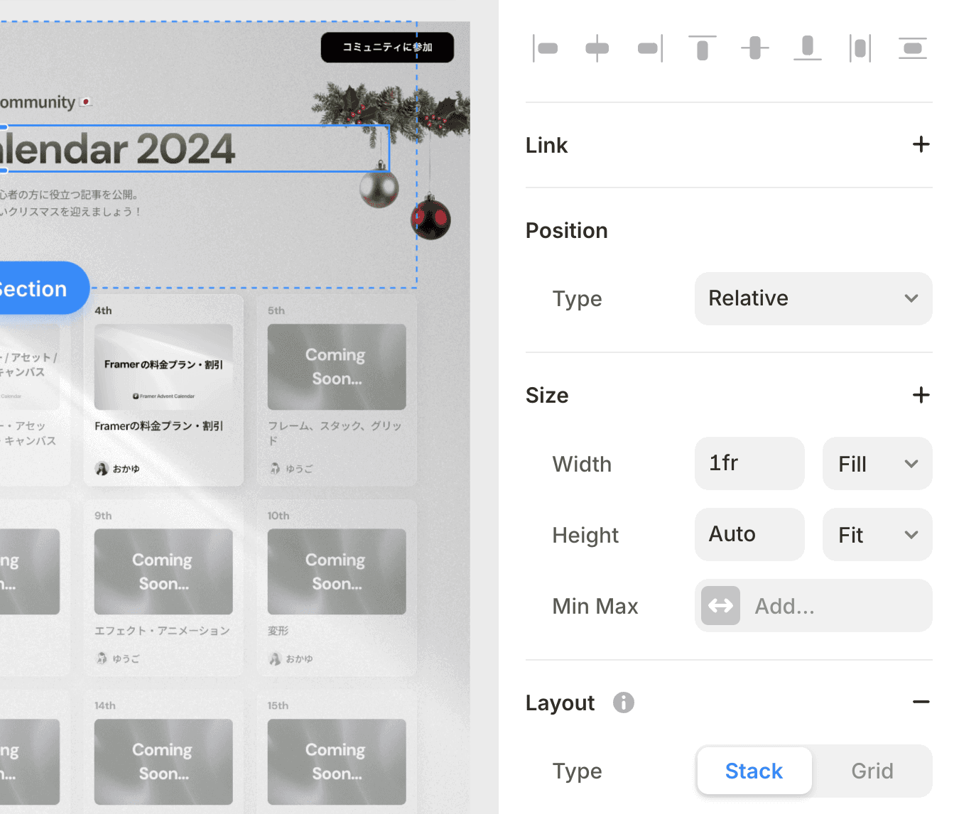
Property Panel
This is the panel located on the right side of the screen. Here, you will style the design. It appears when you select an element. You will adjust design properties such as color, size, positioning, and font. Changes made in the property panel are reflected in real-time on the canvas, allowing you to check the results while adjusting.
Items That Can Be Set in Properties
Examples of items that can be set in the property panel are as follows. Understanding CSS can expedite your comprehension.
1. Layout
X / Y: Position
Width / Height: Width and Height
Padding: Inner Margin
Stack: Flexbox
Distribute: Alignment within Flexbox
Align: Vertical Center Alignment
Grid: Grid
Gap: Gap
Wrap: Wrapping
2. Styles
Fill: Fill
Border: Border
Shadow: Shadow
Opacity: Opacity
Radius: Rounded corners
Visible: Show/Hide
3. Text
Font: Typeface
Font Size: Font Size
Font Weight: Font Weight
Letter Spacing: Letter Spacing
Line Height: Line Height
Alignment: Alignment
Text Transform: Text Transformation
Others
Effect: Effects and Animations. Animations based on hover, loops, scrolling, etc.
Cursor: Cursor Design
Overlays: Overlays, Modals, Pop-ups, Dropdowns
Transform: Transforms. Scaling, skewing, 2D and 3D rotation, etc.
Scroll Section: You can assign IDs to elements for anchor links. Y direction offset is also possible.
Accessibility: Accessibility. HTML tags, Aria Labels, Tab Index, etc.
Code Overrides: Code Overrides. When writing code in React, you can override the movements and specifications of the designated element.
Canvas
Below the page panel, there is a label called Canvas, and clicking it takes you to a new workspace separate from the page. The Canvas does not affect the web page in any way; it is a feature that can be used or not used at your discretion. In simple terms, it is a space to create design comps similar to Figma.
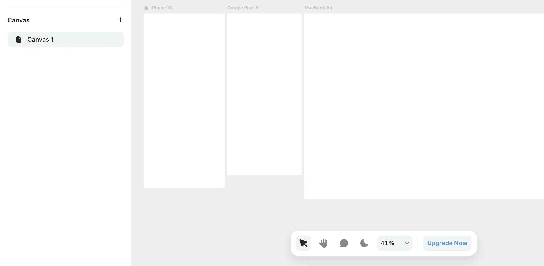
In this way, you can create frames the size of smartphones, plan workflows such as screen transitions and movements, and even create simple prototypes.

←