

Reusable Parts and Designs "Components"
A component refers to reusable parts for constructing designs and interactions. This allows for efficient progress and maintains design consistency.
In Framer, you can easily create components and variants like in Figma and reflect them in web design.
Features of Components
Reusable
A component that has been created once can be reused across multiple pages and projects. This eliminates the need to recreate the same design or function from scratch.Customizable Properties
Components can have properties such as text, images, and colors set, which can be changed for each instance.Dynamic Interactions
You can add animations and interactions (click, hover, scroll, etc.) to components to enhance user experience.
How to Create
There are two ways to create components.
Click the "New Component" button from the components section of the assets panel.

First, create a design in the editor, and then right-click to select "Create Component". Alternatively, you can create it using the shortcut ⌘+⌥+K.
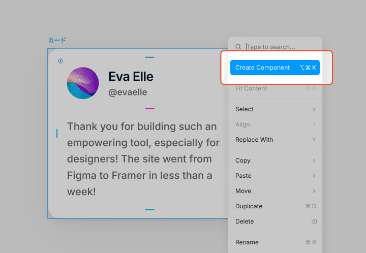
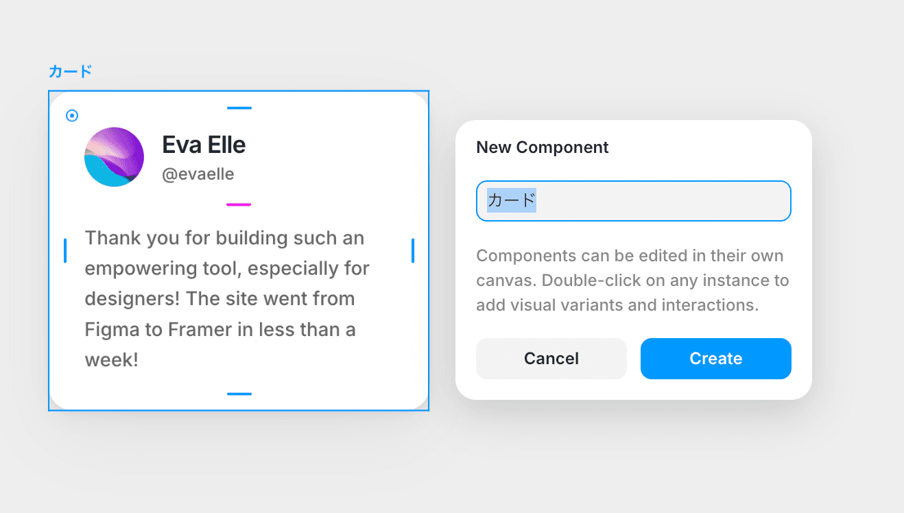
Enter a name for the component and select Create. (You can name it anything)
You will move to a dedicated screen for components. Components are generally enclosed in a purple bounding box, and the layers are also purple for clarity. You can double-click outside the component to return to the normal editor screen.

If necessary, style it or continue designing as usual.
You can add it to the canvas by dragging and dropping from the assets panel.

←