

What are Variants?
It is a feature that allows a single component to have multiple different states (designs and styles). By using this feature, reusable components become even more flexible.
Variants also play a vital role in creating animations and interactions.
Basic Concept of Variants
Defining Component States
Variants can define different styles and properties (e.g., color, size, position, opacity, etc.) as "states" within a single component.Animation Between States
Using variants, you can smoothly animate transitions between states. Framer automatically interpolates the differences in properties to generate smooth transitions.Switching with Triggers
The state of variants can be changed through triggers (e.g., click, hover, scroll, etc.).
Examples of Using Variants
Button Hover Effects
Set the default state of a button and change color and shadow on hover.Modal Opening and Closing Animations
Define the closed and opened states of a modal with variants and switch them with a click.Scroll Animations
Change the opacity and position of a component based on the amount scrolled.Complex Animations
Utilize variants to switch between multiple states in a continuous animation.
How to Create
Here is how to create variants. This time, we will create a button used on the site with multiple states.
Create a component. First, create the basic component.
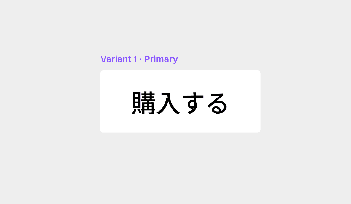
With the component selected, click the + button immediately to the right. This will create the second variant.

Try changing the color, text, and corner radius.

Add the created variant to the canvas.
Variants are a very powerful tool for streamlining interaction design and prototyping, allowing for easy implementation of visually rich animations. Please try creating and experimenting with them.
←